
Our Logo Design

The ACYWA logo showcases an abstract tree taking root in the earth, with leaf-like shapes representing every state and territory in Australia.
Beneath the canopy, the silhouette of three people represents two central themes: the imperative role that individuals and families hold in crafting Australia's identity, alongside ACYWA's core focus on person-centric data, interconnectedness, and community.
Drawn from nature's palette, the final logo employs hues of green, blue, and brown to mirror Australia's rich biodiversity and picturesque landscapes. Reds and ochres - reminiscent of Aboriginal sacred colours - are used in recognition and respect of Traditional Custodians of the land.
The growth of the tree emphasises ACYWA's commitment to improving the welfare of Australia's children and youth, through the provision of pertinent, accessible and beneficial information and resources.
Read on to see how the ACYWA logo was born.
We are thrilled to announce the winners of The Australian Child and Youth Wellbeing Atlas (ACYWA) Logo Competition!
We’d like to express our heartfelt gratitude to each and every one of you for your incredible submissions. The level of creativity and artistic expression displayed by young minds across Australia has been truly inspiring.
It was not an easy decision for the judges but after careful deliberation, our panel has selected the following winners:
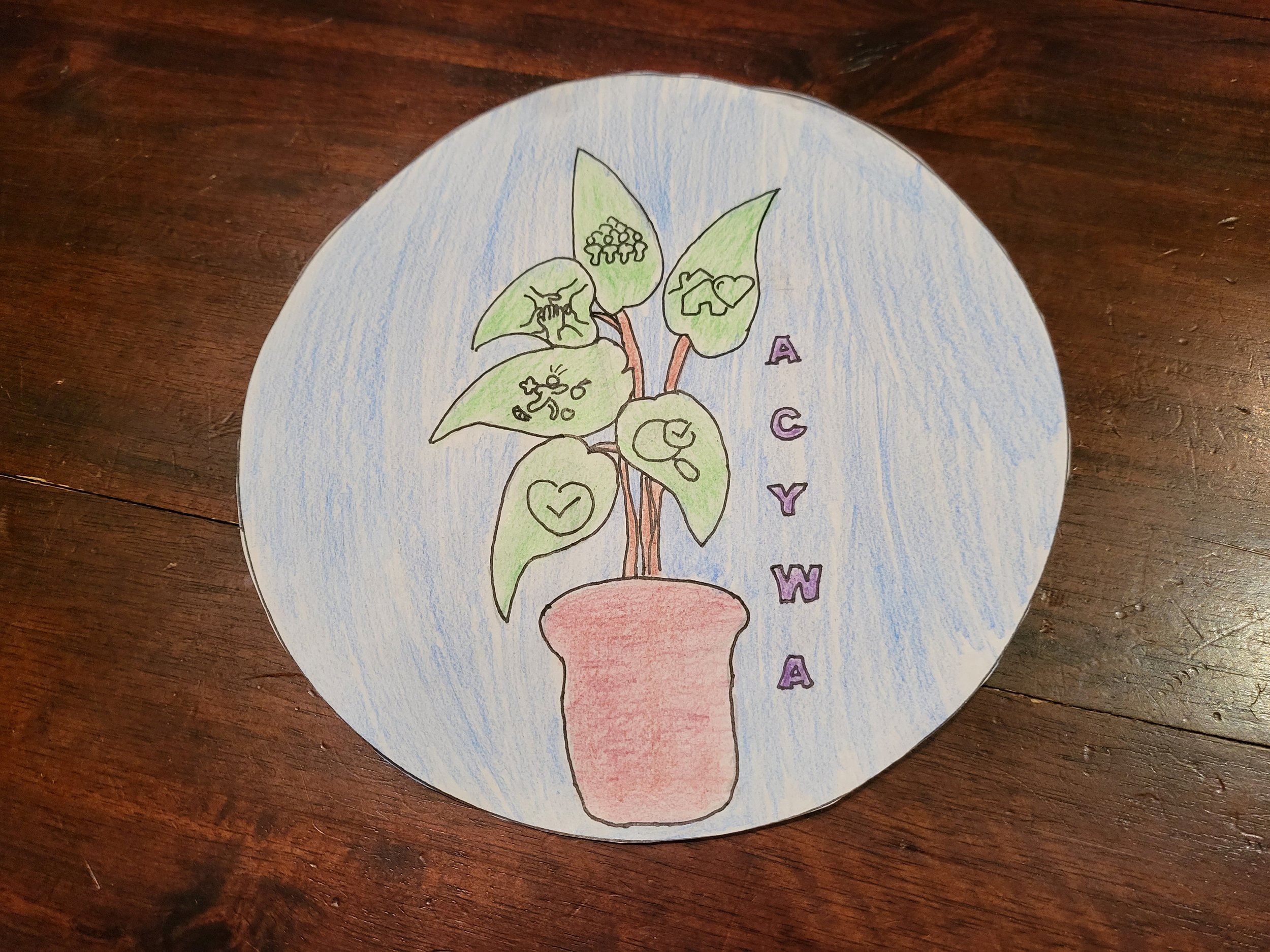
1st place

2nd place

3rd place
Your contributions have been invaluable in shaping The Australian Child and Youth Wellbeing Atlas. We are grateful for your artistic vision and the impact it will have on improving the lives of children and youth across Australia.
We look forward to celebrating your creativity and continuing to witness your artistic journey.
